It’s that time again — the new academic year has begun, and many of our libraries’ article databases have unveiled interface changes. There are usually a couple of these each fall, but I think this year is somewhat unusual in that three of the biggies have redesigned:
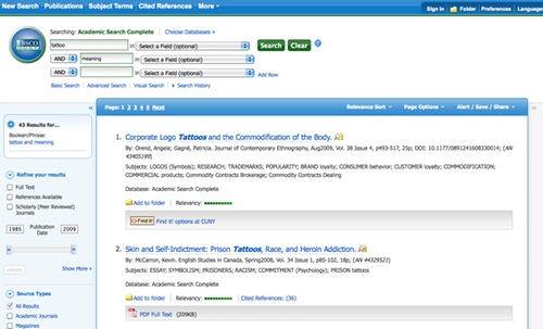
1. EBSCO, including Academic Search Complete
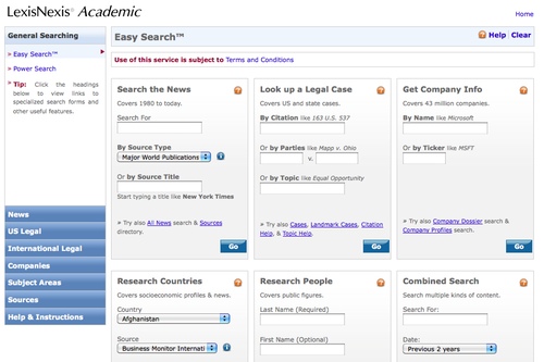
2. LexisNexis, the news and law database
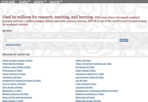
3. JSTOR, the full-text database of scholarly journals across the arts and sciences
I’d wager that these three databases together probably capture the lion’s share of our undergraduates’ searches — if not in total then at least their first attempts at finding information on their research topics. I haven’t had time to fully explore the changes, though I did take a brief spin through each database.
At first glance the EBSCO changes look fairly minor. In their last redesign they added an incredibly useful feature — a pop-up bubble that displays an article’s abstract from the results list — so I’m predisposed to feel positive about this redesign.
On the results list, all of the options that can be used to refine results have been moved to the left side of the page (previously they were split between left and right columns). I’d guess this will make it much easier for students to use these options.
Another nice new feature is that once you click through to the article detail page, the links to use to print, save, email, etc. the article appear in the right column under the Tools menu.
Of course these are only a few of the changes, but I’d like to point out just one more that I like: in the top navigation bar the Thesaurus link now reads Subject Terms. The less time librarians have to spend explaining library jargon, the better (IMHO).
I’ve always disliked the LexisNexis interface so my hopes were not high for this redesign. So I was pleased to see that the changes have made LexisNexis much easier to use.
While the Easy Search page looks a bit busy, most students will probably get the most use out of the Search the News box. And the news search from this page is much, much better than it used to be. It’s streamlined, and with far fewer choices it is far less confusing. An advanced search with more fields and limiters is just one click away on the All News page.
Most importantly, the News search now defaults to all available dates. Previously the default date range was only the prior two months, and the dropdown menu to change this option was all the way at the bottom of the page and very easy to miss.
I’m still not a big fan of the LexisNexis results or article displays (why are the icon links for printing/saving/emailing so incredibly tiny?), but the search redesign is definitely a step in the right direction.
And then there’s JSTOR. JSTOR caused quite a stir late last month when their interface changes were unveiled. Briefly: when the redesign launched, the search results defaulted to displaying articles from all publications archived by JSTOR. While this doesn’t sound like a problem in theory, in practice not all libraries subscribe to all JSTOR collections. The kicker is that initially JSTOR didn’t enable OpenURL, which allows libraries to link between databases. This meant that search results were potentially returning lots of articles that could be available in another database, except there was no way to link over to them.
Lots of librarians cried foul when they realized the scope of these changes, and you may have seen the article at Inside Higher Ed and several blog posts (here and here, to name just two) about the kerfluffle. And luckily JSTOR responded pretty quickly, so OpenURL has been enabled.
Other than the linking issues, I think the JSTOR interface changes are great. Again, I’d never been fond of their previous interface – I found it deceptively simple with just the one field for search terms, and the Advanced Search always seemed overly confusing. The new interface still has just one field, but with the addition of Browse By Discipline links that make it easier to drill down to a specific journal or quickly scan the journals available in each subject.
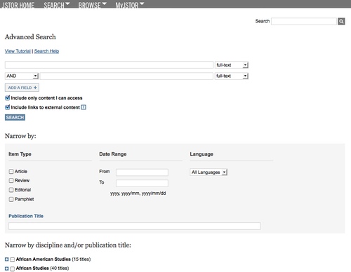
The Advanced Search also seems streamlined and easier to use. Again there’s the option to limit by discipline or individual journal, which seems like it will be really useful for beginning students who may get far too many results if they search across all disciplines.
These redesigns will definitely change the way I teach students how to use EBSCO databases, LexisNexis and JSTOR. At City Tech our research and library instruction program starts up again tomorrow, and I’ll be interested to see how students react to the changes, too.


1 response so far ↓
Footenotes » Blog Archive » The Contrite Round Up – 8/24ish to 9/5 // Sep 6th 2010 at 10:54 pm
[…] archives messed around with their interfaces and Maura walks us through them. There’s a little note at the end about librarians lighting torches and storming JSTOR, check it […]
Leave a Comment